
When candidates register for a large-scale examination, they don't get assigned a centre at random — they choose their preferred exam centres themselves, usually from a list tied to their region. Most candidates pick sensibly: a centre in their own city, or the nearest one available. But across a candidate pool of hundreds of thousands, a meaningful number end up choosing a centre hundreds of kilometres from home — even when several much closer centres were sitting right there as options.
This is worth paying attention to. Sometimes it's an innocent mistake — a wrong selection during a rushed registration. Sometimes it reflects something more deliberate: a pattern worth flagging for review, for example candidates clustering into a distant centre for reasons unrelated to convenience. Either way, an examination body running a process at this scale can't manually check every candidate's choice against a map. They need an automated way to ask, for every single candidate: did this person choose a centre that's an outlier, given what was actually available to them nearby?
That's the problem we set out to solve — not "who got assigned somewhere far," but "who chose somewhere far, when they clearly didn't have to."
In this post
You will learn:
- Why raw distance is a bad measure of an anomalous centre choice, and what to ask instead
- How messy address text — pincodes, district aliases, zone prefixes — has to become coordinates before any of the math is honest
- How we rank a chosen centre against every other real option, then apply a 500 km floor so dense cities don't produce false flags
- How the pipeline batches and parallelises scoring so a pool of hundreds of thousands is a routine check, not an hours-long review
If you already know why kilometres alone mislead, skip to How we designed the solution.
The problem
Staff Selection Commission notices make the choice explicit: a candidate must indicate preferred centres in the online application, typically three centres in order of priority, and later requests to change that choice are not entertained. The SSC CGL 2026 notice is typical — select carefully, because the preference is treated as final. That is the right design for logistics. It is also why a bad choice is sticky: once it is in the form, the examination body is stuck with it unless someone notices.
Most choices are ordinary. A candidate from a district town picks the nearest listed city. A candidate in a metro picks a centre across town. Neither of those is a mystery. The cases that matter sit in the tail: people who skip a dozen nearer options and land hundreds of kilometres away. Some of that is a dropdown error. Some of it is a cluster — several candidates from the same area converging on the same distant centre, which is the pattern integrity teams actually want on a desk, not buried in a spreadsheet.
Not "who got assigned somewhere far," but "who chose somewhere far, when they clearly didn't have to."
Integrity work at this scale is a risk-management problem, not a detective novel. The OECD Recommendation on Public Integrity treats merit-based professional public service as something you protect with a coherent, risk-based system — including the ability to surface integrity risks instead of discovering them after the fact. An examination body that cannot ask a precise question of every application is left hoping the odd cases will volunteer themselves.
This is the same class of check that ships inside SSC Suchita, the examination-integrity platform we built for the Staff Selection Commission — geographic risk sitting alongside identity, documents, and behavioural forensics, so a flagged choice is a case with a reason, not a vibe.
How we approached it
The tricky part isn't measuring distance — that's simple. The tricky part is deciding what should even count as far, and that took two separate ideas.
Rank, not kilometres
How many real centres sat closer than the one they picked — the signal that survives sparse geography.
Clean the map first
Pincodes, district aliases, and zone prefixes have to resolve to one coordinate before any rank is honest.
First: raw distance alone is a bad measure of "anomaly." A candidate from a remote area might legitimately have their nearest centre 300 km away — that's just where they live, not a red flag. So instead of picking an arbitrary distance cutoff, we asked a more precise question: out of every centre that existed, how many were actually closer to this candidate than the one they picked? If a candidate skipped past 15 closer options to choose a centre far away, that's a strong, self-evident signal — regardless of the exact number of kilometres involved. If they simply live somewhere sparse and their "far" choice was still their 2nd or 3rd nearest option, that's not an anomaly at all — that's just geography.
Second: real-world location data is messy, and had to be cleaned before any of this math could work. Candidate addresses and exam centre names arrive as free text — district names spelled several different ways, city names with prefixes like "SR-" or "WR-", parenthetical notes, or just a centre code with no name attached at all. Before we could compare a single distance, we had to reliably turn all of this messy text into precise, consistent coordinates on a map.
That cleaning step is not a nicety. India's PIN codes are a structured national index — the All India Pincode Directory on the Open Government Data platform is the official Department of Posts list — but candidates do not always type a PIN, and centre names are not always a PIN. You need a cascade that prefers the structured identifier when it exists, and degrades honestly when it doesn't.
How we designed the solution
With that framing settled, the system runs in three stages — resolve locations, score the choice, then filter for review:
1. Turn every address and centre into a precise location
We resolve locations using a layered strategy, cheapest and most reliable first:
Pincode lookup
Match the candidate PIN against a known coordinates table — cheapest and most precise when it hits.
Normalise the name
Strip zone prefixes, “district” suffixes, and spelling quirks so variants of the same place resolve together.
Live lookup, once
Geocode as a last resort, then save the result so the same city is never looked up twice.
- Look up the candidate's pincode against a known coordinates table — the most precise option when available.
- Fall back to matching their district or city name against reference data, normalising away naming inconsistencies (stripping zone prefixes, "district" suffixes, and formatting quirks) so that name variants of the same place all resolve correctly.
- As a last resort, look the location up live — and immediately save that result for reuse, so the same city is never looked up twice across the entire run.
The live lookup is the expensive and least controlled step, so it sits last. Caching it is what keeps a pool of hundreds of thousands from becoming hundreds of thousands of identical geocode calls for "Lucknow" spelled four ways.
2. Score each candidate's choice, not just their distance
For each candidate, we calculate the distance to their chosen centre, and — more importantly — we rank it: how many other real centres were closer than the one they picked. That rank determines the category:
1st–4th
No issue
The chosen centre is among the four closest options. Geography, not a flag.
5th–10th
Within limit
Further than ideal, still inside the band reviewers treat as ordinary choice.
11th–15th
Anomaly
They passed a dozen closer centres. Worth a look — if distance also clears 500 km.
16th+
Severe anomaly
The choice sits far down the nearest-centre list. Strongest signal for review.
A candidate is only flagged when their choice falls in the anomaly bands and the absolute distance clears a 500 km floor — so someone in a dense city with lots of nearby options doesn't get flagged just for a technical rank difference of a few kilometres.
The floor is doing real work. In a metro, the 11th-nearest centre can still be across town. Rank without distance would drown reviewers in noise. Distance without rank would drown them in people who live far from everything. Together they isolate the actual question: skipped many better options, and travelled far to do it.
3. Run this across the entire candidate pool, quickly
With candidate counts in the hundreds of thousands, we couldn't process this one record at a time. The pipeline validates and batches candidate records, processes many batches in parallel, and writes flagged results back to the database in bulk rather than one row at a time — turning what could be an hours-long manual review into a routine automated check.
Validate, then batch
Records are checked and grouped before scoring — one bad row does not stall the pool.
Score in parallel
Hundreds of thousands of candidates, many batches at once, not one record at a time.
Write flagged rows in bulk
Reviewers get a list, not a trickle — bulk inserts instead of a row-by-row round trip.
That is the difference between a notebook someone ran once and a control an examination body can re-run every cycle. World Bank GovTech programmes treat this kind of operational data use as core to modern service delivery: not a dashboard for its own sake, but a way for the institution to see risk while there is still time to act.
What comes out the other end
The result is a clean, explainable list of flagged candidates — each one showing exactly which centre they chose, how far it was, and how many closer centres they passed over to get there. Nothing is a black-box score: a reviewer can see, in plain terms, exactly why a particular choice stood out from the rest of the pool.
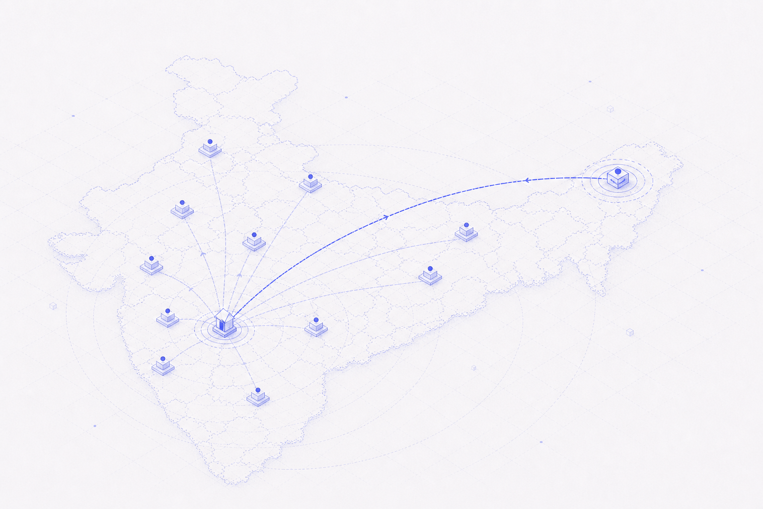
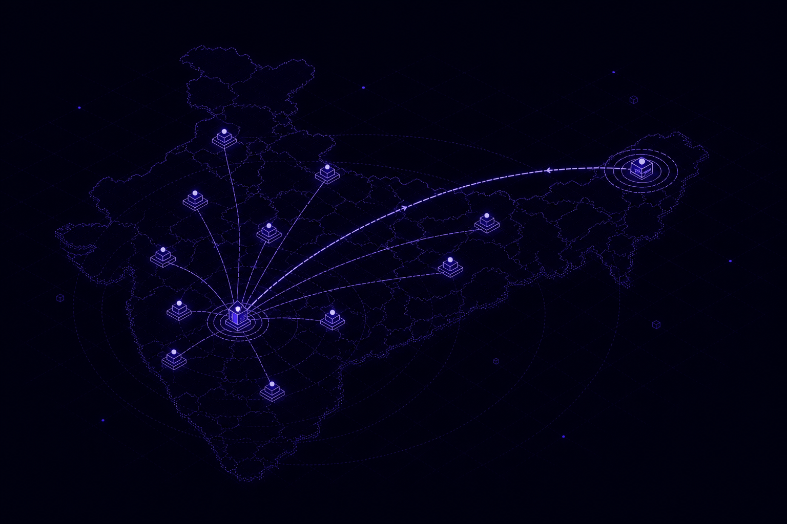
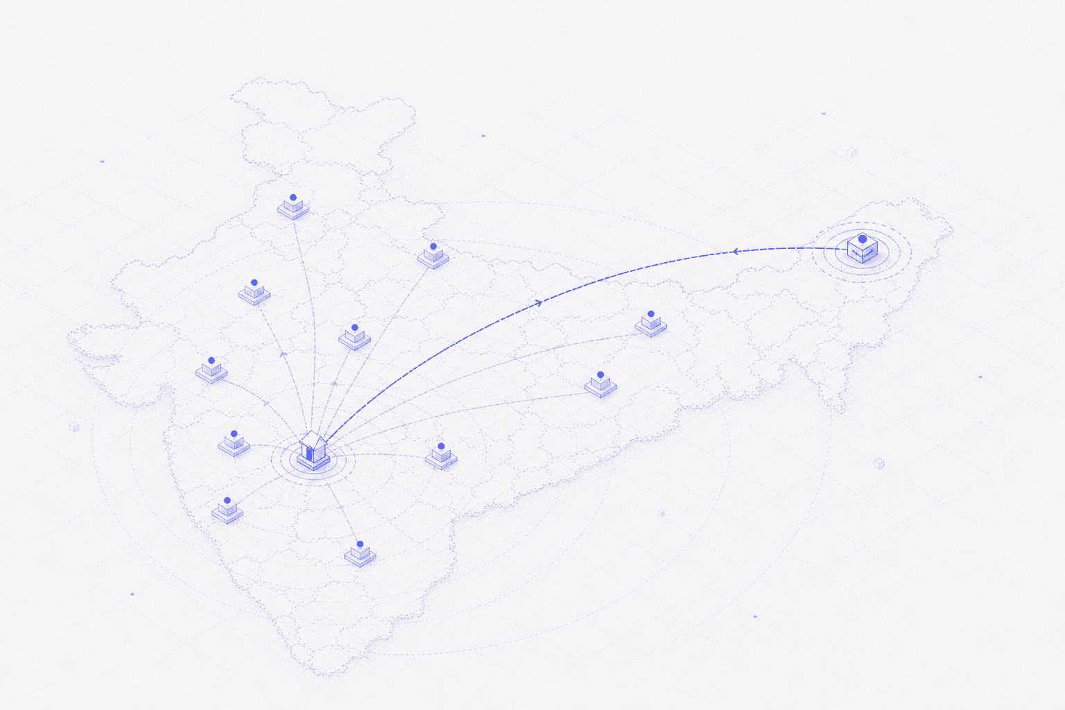
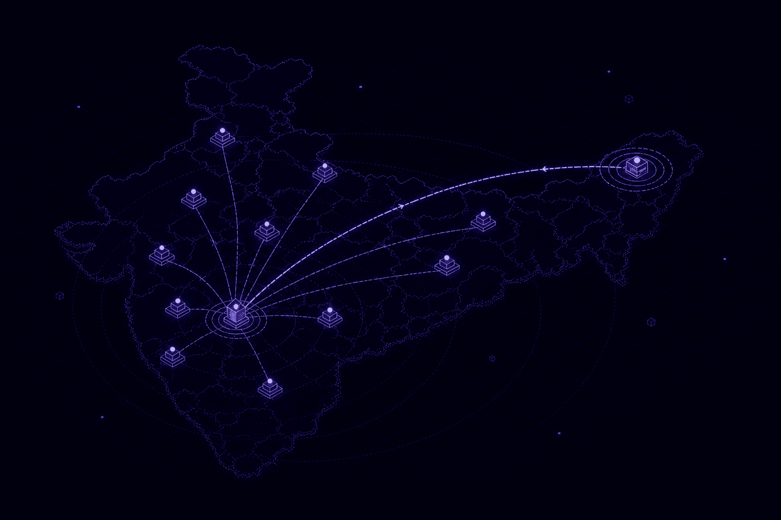
On the map, those cases read as long arcs — home location at one end, chosen centre at the other — filterable by how extreme the distance rank is on the current page.
The same cases land in a review table: registration number, chosen city, distance in kilometres, and the address the candidate gave. A Kerala address paired with Srinagar, or Assam with Thiruvananthapuram, is no longer buried in a spreadsheet — it is a row with a distance and a reason.
That explainability is the point. An integrity flag that cannot be defended in a hearing is not a flag — it is a liability. Officers need the same facts the model used: home location, chosen centre, distance, rank, and the nearer options that were skipped. Then a human decides whether the case is a typo, a genuine constraint, or something that belongs in the dossier.
It's a good example of how the hard part of a problem like this usually isn't the math — it's deciding what question you're actually asking. "How far away is this centre?" is easy to answer and mostly useless. "How many better options did this person pass over?" is a little harder to compute, but it's the question that actually tells you something.
"How far away is this centre?" is easy to answer and mostly useless. "How many better options did this person pass over?" is the question that tells you something.
Further reading
- SSC — Combined Graduate Level Examination 2026 notice (centres of examination) — candidates select three centres in priority order; later change requests are not considered
- OECD — Recommendation of the Council on Public Integrity (2017) — merit-based public service and a risk-based integrity system governments can actually run
- World Bank — GovTech priority themes — operational data and accountability as part of digital public services
- data.gov.in — All India Pincode Directory (Department of Posts) — the structured PIN index used as the first, cheapest geocoding layer